| Note |
|---|
This feature is available only for the cloud version of ARN. |
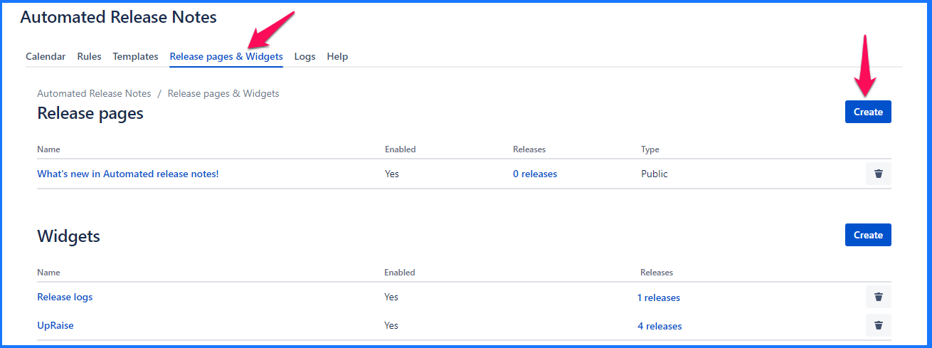
Release pages
Release pages is the easiest way to publish your release notes or a changelog on a public page. Once the release page is saved and rules are configured, release page is updated whenever configured rules are triggered.
Create release page
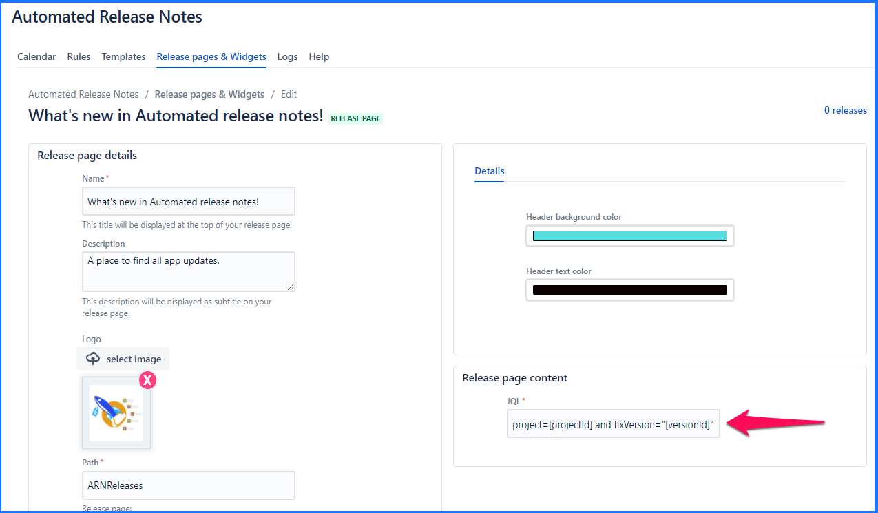
In 'Release page details' section add the following details.
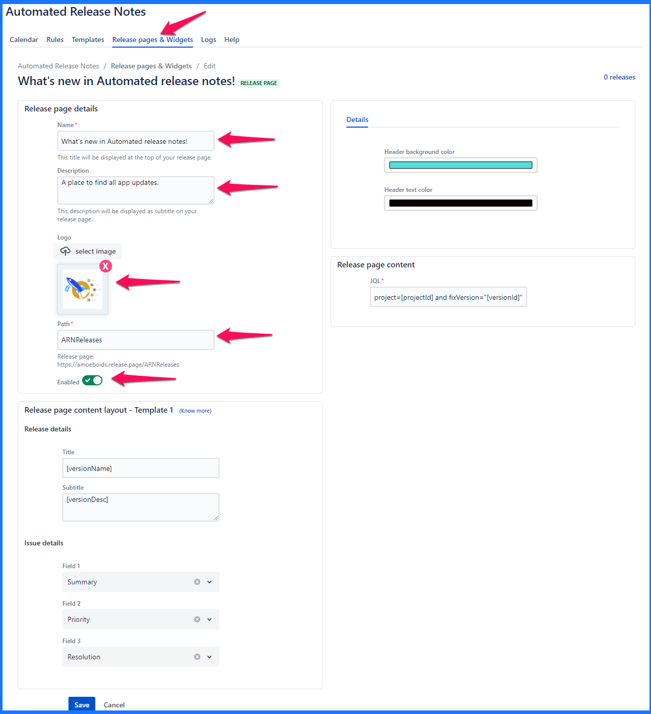
Name - Name of the release page. This will be the top heading/title of the page.
Description - This will be displayed as the subtitle on the page.
Logo - Upload an image here. Typically this can be your product or company logo. Currently square sized logos are supported, we are extending this for rectangular logos soon.
Path - This will be the public link that you can share with the audience of the release page. Here you only need to add the text that is relevant to the release page and then copy the URL displayed below path field to use it as your release page URL.
Enabled - You can turn off when you don’t want release page to be publicly visible. If release page is supposed to be available, it should be turned on.
'Release page content layout - Template 1' contains the following details -
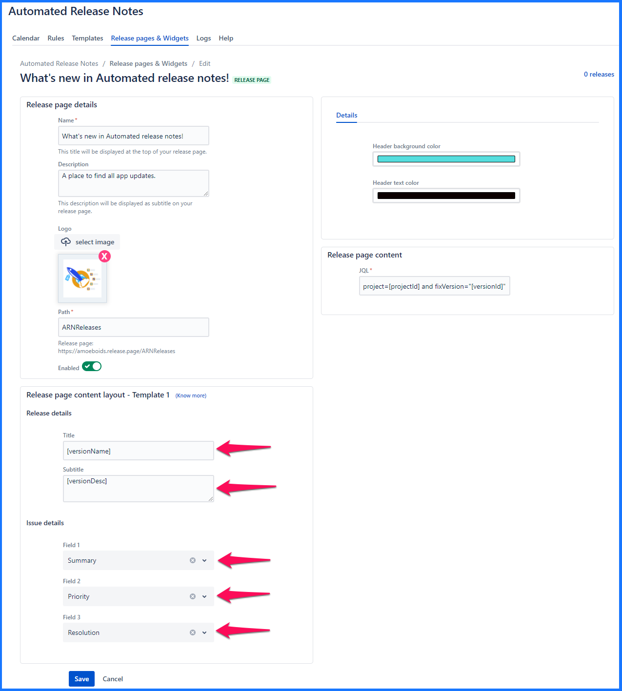
Release details
Title - Any title that relates to the release
Subtitle - Any subtitle that relates to the release
Issue details - Select any 3 Jira issue fields here. These fields will be displayed on the page for issues that are displayed on the release page. Currently, only a simple layout that makes use of these 3 fields is available. Each of those three fields are Jira issue field selectors. One can choose either default attributes or even the custom ones.
Title & Subtitle can contain variables. Read Release page & Widget templates for more details.
Additional details like look & feel are configured under the ‘Details’ tab of the right-hand side section.
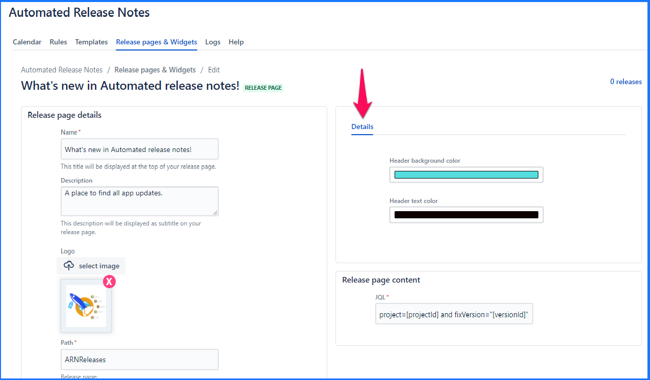
In the ‘Release page content,’ a JQL is defined that determines what data is populated on release page. Every time the release page action is triggered, it will look at the JQL & pull out the relevant issues. Similar to how the JQL section is configured, you can use variables in this text box.
Once the JQL is added, click anywhere outside of the box &  or
or  will be displayed to convey the correctness of the JQL.
A sample JQL that can be used: Project = ARN AND issueType = “New Feature” AND fixVersion = “[versionName]”
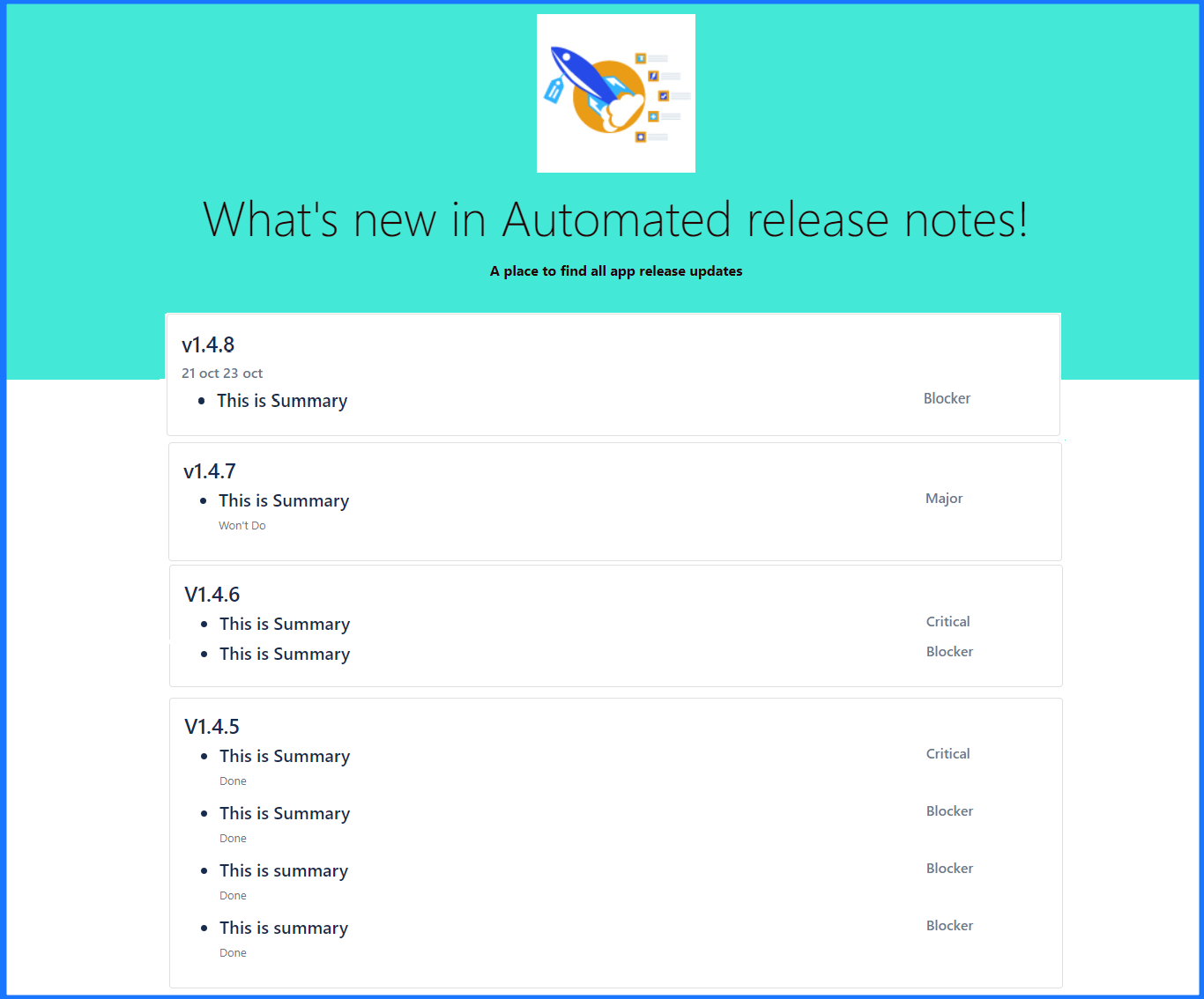
This is how the release page will look like when someone accesses the release page URL (the one that is displayed below ‘Path’ field.).
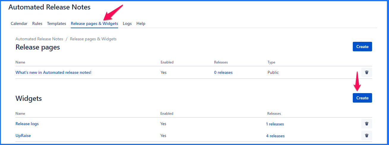
Edit release page
Clicking on the name of the existing release page brings you to the edit screen. It is exactly the same as create, only that the existing data is pre-populated & can be modified.
Note that, issue details in 'Release page content layout - Template 1' section cannot be modified if there are one or more releases associated with that release page. Observe the message displayed below.
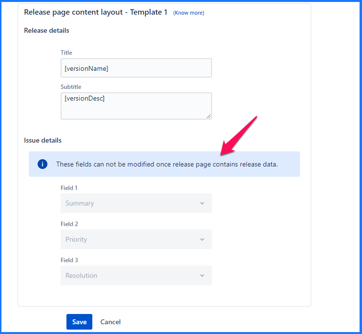
The only way to modify these fields is to delete existing releases from the release page & then come back to edit release page to update issue details.
Delete release page
Clicking on the ‘Trash’ icon on the release pages listing section will trigger the ‘Delete’ action. Note that, the release page can be deleted only after it has been removed from any rule actions.
Deleting a release page is irreversible.
In further enhancements of release pages, we plan to add subscribe button so that anyone can subscribe to it. If you have any suggestions feel free to share with us via our support desk.
Widgets
Widget is a brand new way to communicate release notes with your customers. It lets you embed the release notes in the form of a widget, directly in your web app. Once configured, you get a Javascript snippet that can be added to any HTML page for the widget to appear.
Create widget
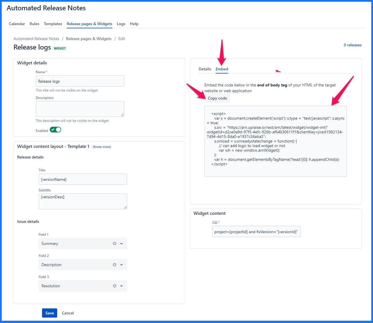
In the ‘Widget details’ section, add the following information for the widget.
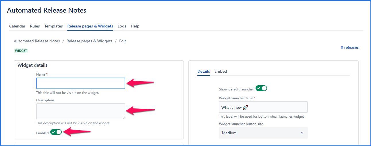
Name - e.g. Admin web-app widget. Note that this name will not be shown anywhere on the widget, it is only for your reference.
Description - e.g. We have used this widget in the Admin web-app. Note that this description is not shown anywhere on the widget, it is only for your reference.
Enabled - This toggle dictates whether the widget is loaded into the web-app or not. For whatever reason, if you wanted to prevent the widget from loading - just turn this off.
In the ‘Widget content layout - Template 1’ sections, add the following attributes

Release details
Title - Any title that relates to the release
Subtitle - Any subtitle that relates to the release
Issue details - Select any 3 Jira issue fields here. These fields will be displayed in the widget along with information relevant to these fields. Currently, only a simple layout that makes use of these 3 fields is available. Each of those three fields are Jira issue field selectors. One can choose either default attributes or even the custom ones.
Title & Subtitle can contain variables. Note that this section is not used anywhere currently. But we will enhance the issue layouts to make use of this information. Read Release page & Widget templates for more details.
Additional details like look & feel are configured under the ‘Details’ tab of the right-hand side section.
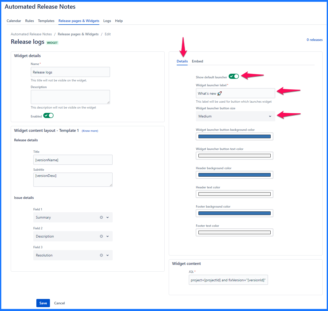
Show default launcher - This toggle identifies whether the widget launcher is available on-screen by default. If disabled, the launcher won’t be displayed until made visible by another action.
Widget launcher label - e.g. Release notes. This is what the button text will be, to open/close the widget.
Widget launcher button size - Small, Medium, Large
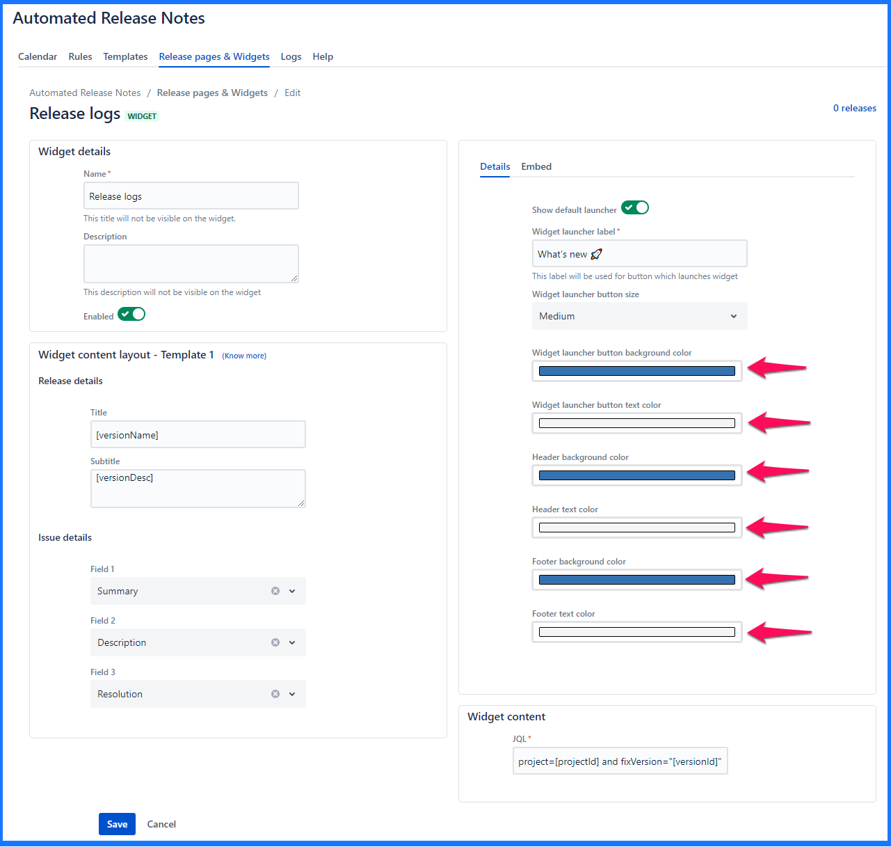
Rest of the configurations deal with the look & feel of the widget
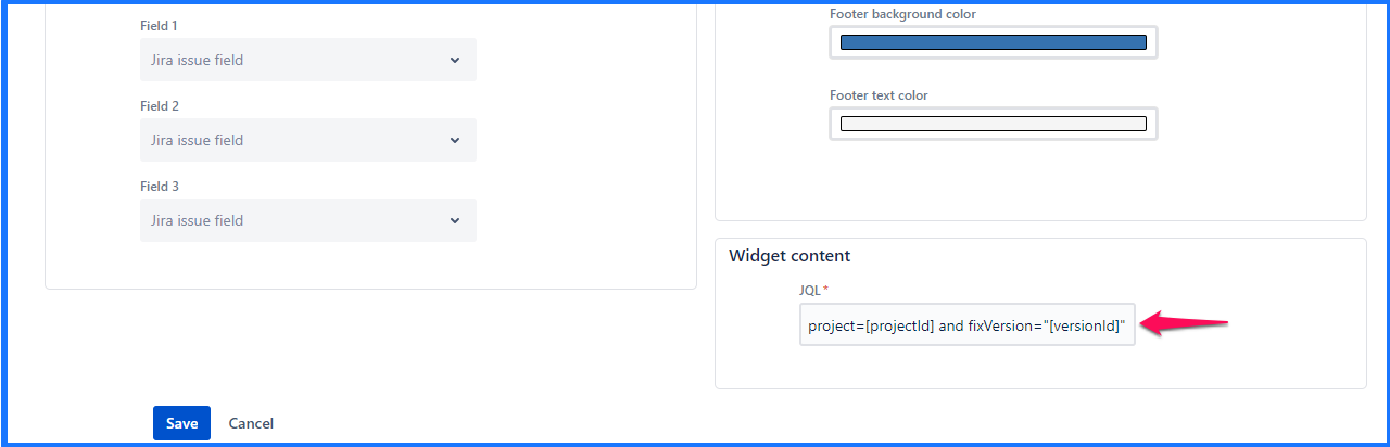
In the ‘Widget content’ a JQL is defined that that determines what data is populated within the widgets. Every time the widget action is triggered, it will look at the JQL & pull out the relevant issues. Similar to how the JQL section is configured, you can use variables in this text box.
Once the JQL is added, click anywhere outside of the box & or will be displayed to convey correctness of the JQL.
A sample JQL that can be used:
Project = ARN AND issueType = “New Feature” AND fixVersion = “[versionName]”
Embed code
Once all the mandatory information is filled in & ‘Save’ button is clicked - the Embed code becomes available.
Edit widget
Clicking on the name of the existing widget brings you to the edit screen. It is exactly the same as create, only that the existing data is pre-populated & can be modified.
Note that, template fields cannot be modified if there are one or more releases associated with this widget. Observe the message displayed below.
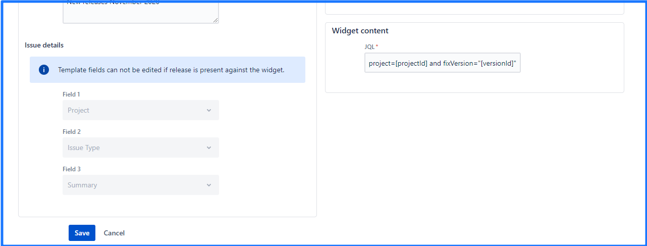
The only way to modify field mapping is to delete existing releases from the widget & then come back to update field mapping.
Delete widget
Clicking on the ‘Trash’ icon on the widget listing section will trigger the ‘Delete’ action. Note that, the widget can be deleted only after it has been removed from any rule actions.
Deleting a widget is irreversible.
Further reading
| Child pages (Children Display) | ||
|---|---|---|
|
On this page | ||||||||
|---|---|---|---|---|---|---|---|---|
|
| Iframe | ||||||||||||
|---|---|---|---|---|---|---|---|---|---|---|---|---|
|