Versions Compared
Key
- This line was added.
- This line was removed.
- Formatting was changed.
Release pages & widgets are built on top of a special type of template. These types of templates are pre-defined by us & end users can simply determine what fields go in what location.
We are currently expanding the default templates for both, release pages & widgets.
Release page templates
Template 1
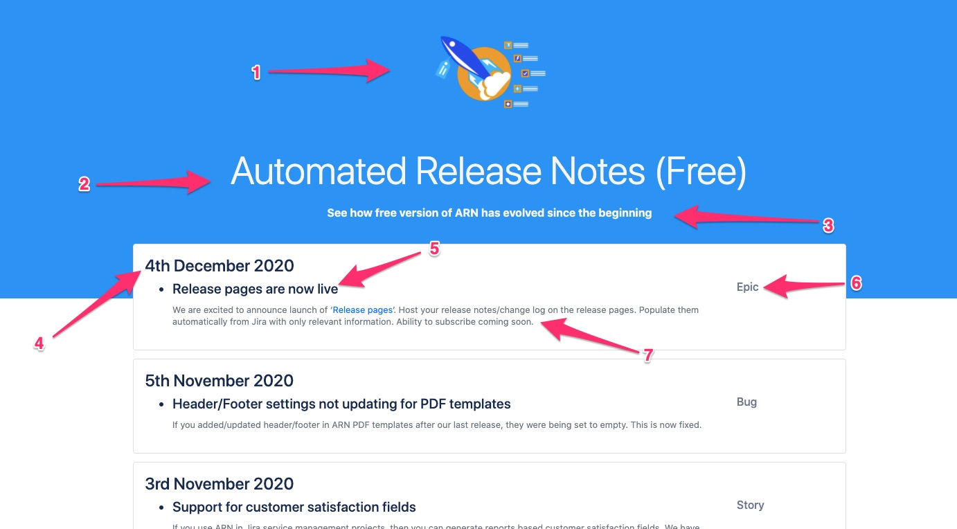 Image Modified
Field locations:
1 - Logo
2 - Page title
3 - Page description
4 - Release title
5 - Issue field 1
6 - Issue field 2
7 - Issue field 3
| Info |
|---|
Check out our release page with Template 1 - here |
Template 2
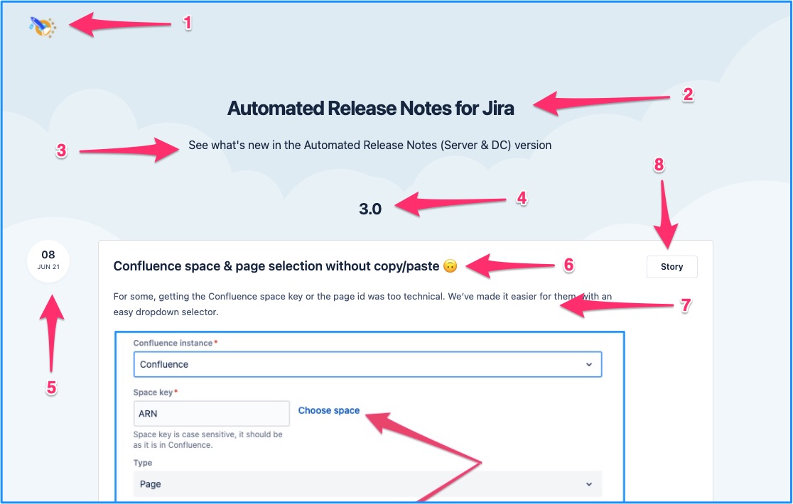
Field locations:
1 - Logo
2 - Page title
3 - Page description
4 - Release title
5 - Release subtitle (fixed as [releaseDate])
6 - Issue field 1
7 - Issue field 3
8 - Issue field 2 (fixed as issue type)
| Info |
|---|
Check out our release page with Template 2 - here |
Widget templates
Default template
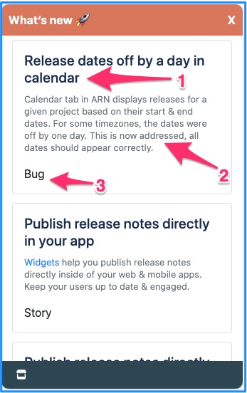 Image Removed
Template 3
| Note |
|---|
The team is planning significant improvements to the Release page feature and will soon phase out Template 3. Users are advised to utilize only Template 1, Template 2 & Template 4 moving forward. |
This template is a bit different in terms of the UI it provides. The release page lists the releases published. When clickec on the relase, it shows the issues in the release. You can scroll issues in the issues using the Next & Previous button.
.gif?version=1&modificationDate=1725963443116&cacheVersion=1&api=v2&width=724) Image Added
Image AddedTemplate 4
 Image Added
Field locations:
1 - Logo
2 - Page title
3 - Page description
4 - Title
5 - Release subtitle
6 - Issue field 1
7 - Issue field 2
8 - Issue field 3
Widget templates
Template1
 Image Added
Template 2
Below image shows the fields in the template -
 Image Added
Below images show the output of the same template set up -
 Image Added
Widget modes
In addition to the template, widgets can have different modes. Based on the selected modes the way widget is embedded into your web page changes.
There are there modes options to choose from
Floating widget
Floating widgets load on top of the contents of an existing web page. The floating widgets can have a dedicated widget launcher button.
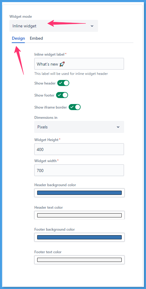
Inline widget
Inline widgets appear ‘inline’ with the contents of the webpage. They load within an ‘iframe’ which can be embedded within any page of a web app or a mobile app.
Bar widget
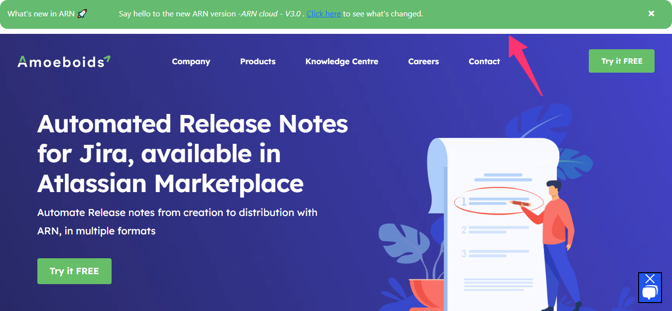 Image Modified
This is a special type of widget that appears as an announcement bar either on the top or bottom of the web page. You can use bar widgets to display important release announcements.
Releases published on the bar widgets have a set expiry period after which they stop showing up.
Here are the settings specific to the bar widget
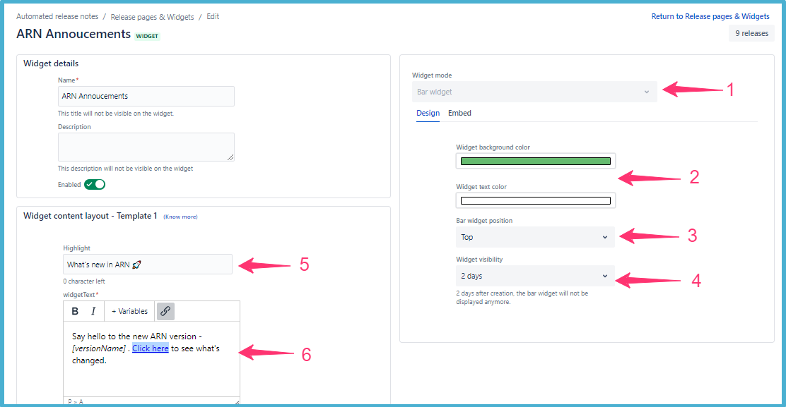
Select the bar widget mode while creating the widget. This mode cannot be changed once widget is created.
Select a background color and font color suitable to the look and feel of the web page where you are going to embed this widget.
Select bar position - Top or Bottom
Expiry - Set the expiry period. You can choose anything from 2/7/15/30 days.
Highlight - Enter the widget highlight text here. This will act as the title of your annoucementannouncement.
Widget text - this is the content of your announcement. You can include ARN variables like [VersionName] here. You can include hyperlinks to your release pages or confluence page. In the hyperlinked, you can also use URL variables like [releasePageURL] or [confluenceURL]
On this page | ||||||||||||||
|---|---|---|---|---|---|---|---|---|---|---|---|---|---|---|
|
| Iframe | ||||||||||||
|---|---|---|---|---|---|---|---|---|---|---|---|---|
|